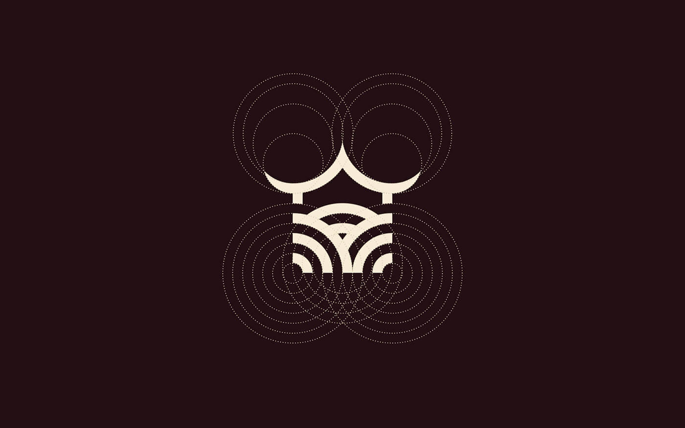
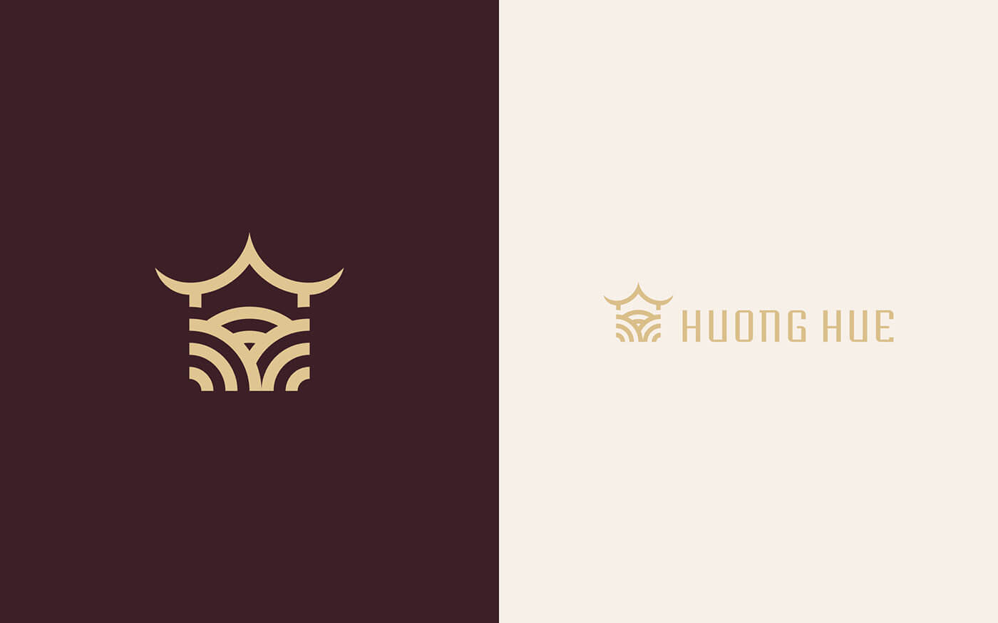
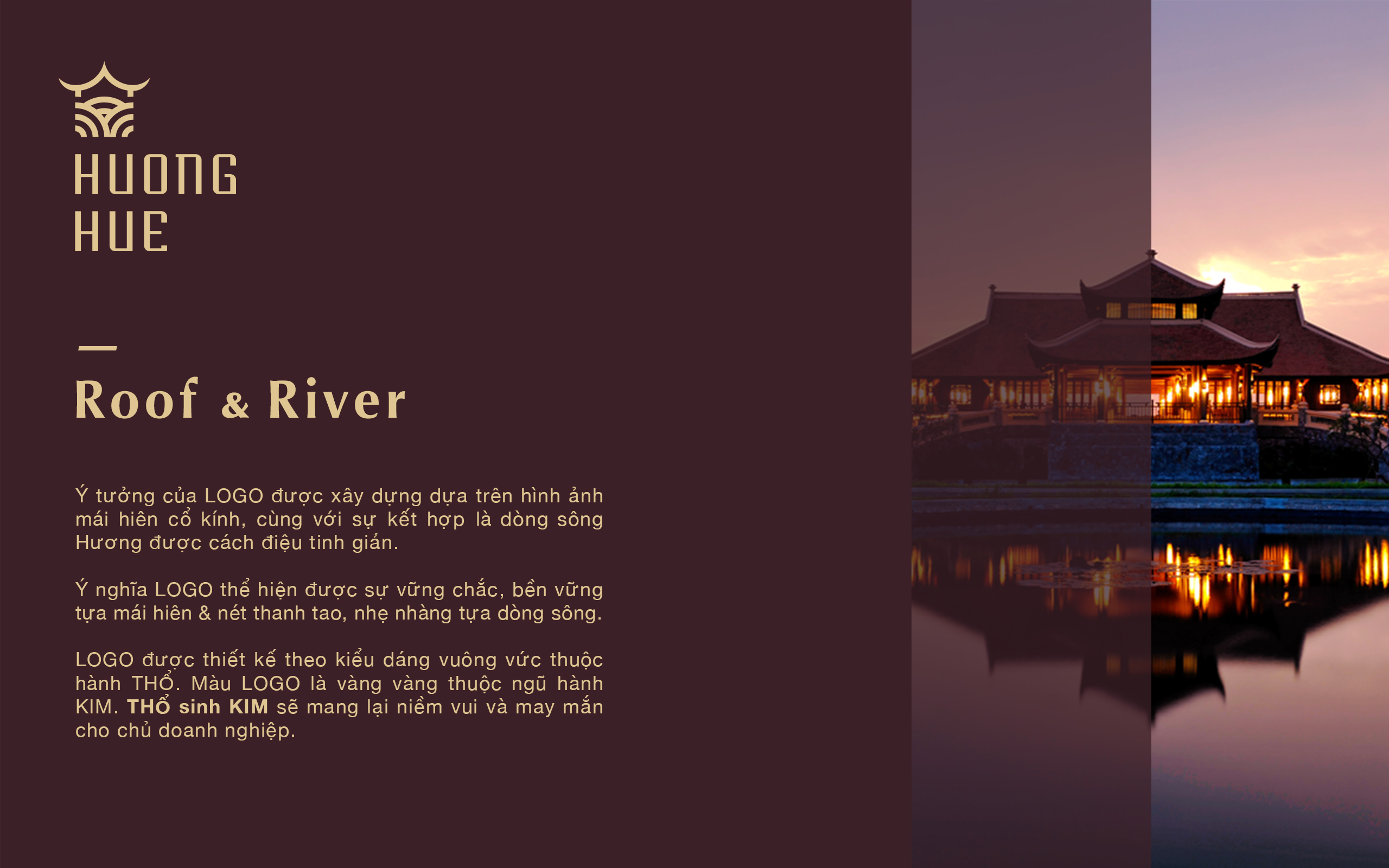
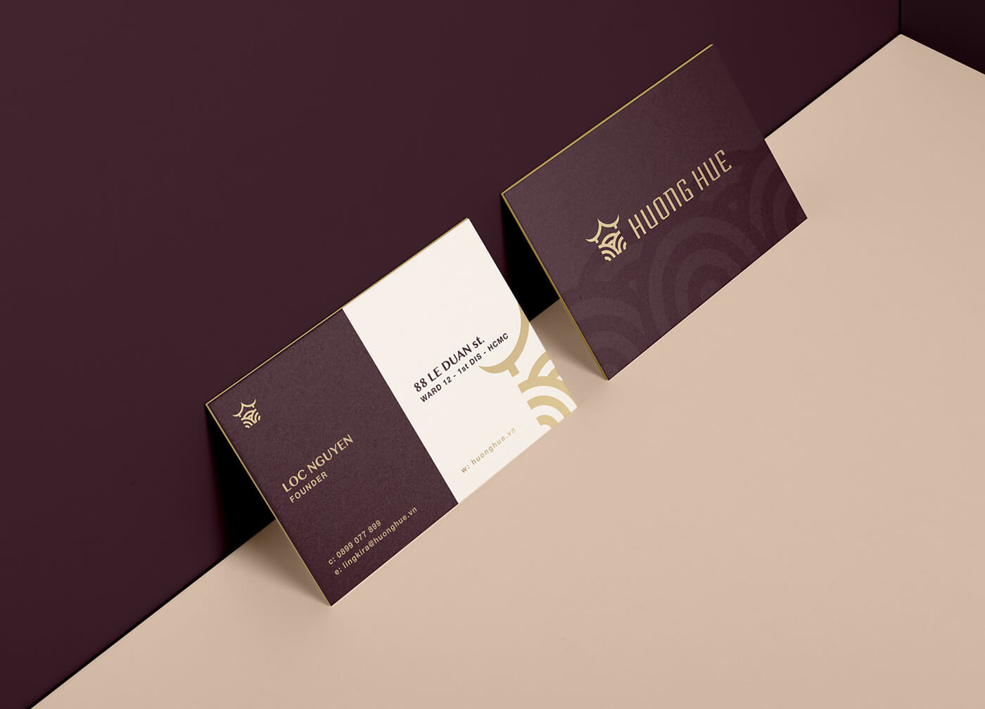
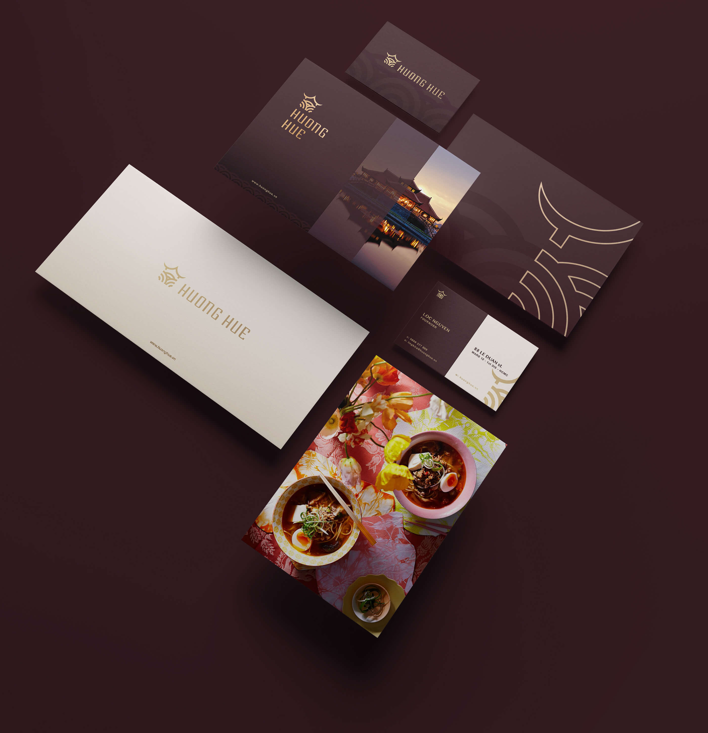
The idea came from an ancient temple rooftop, together with the combination of the streamlined Huong River.
The meaning of LOGO is solid, durable and smooth like the elegance of the river.
This logo was designed with a chunky shape which belongs to the Earth. LOGO color is yellow element of medal.
Earth turns to Medal will bring joy and luck to business owners.
cb8acc66203623.5b0e3834678cb
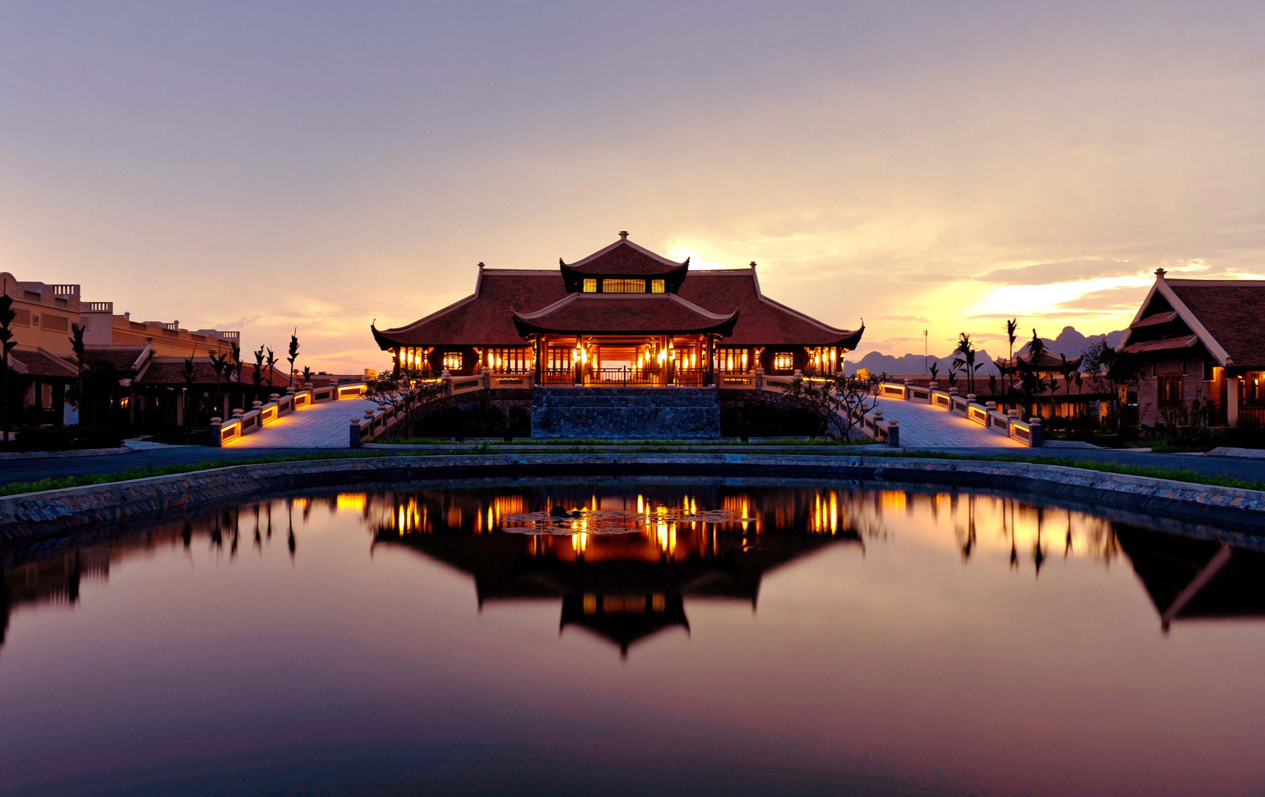
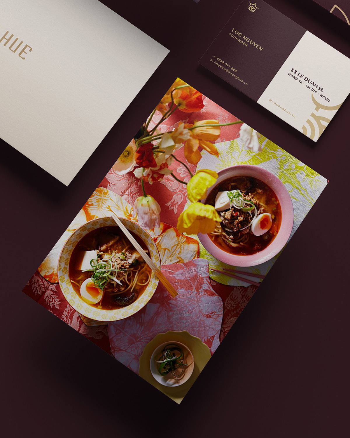
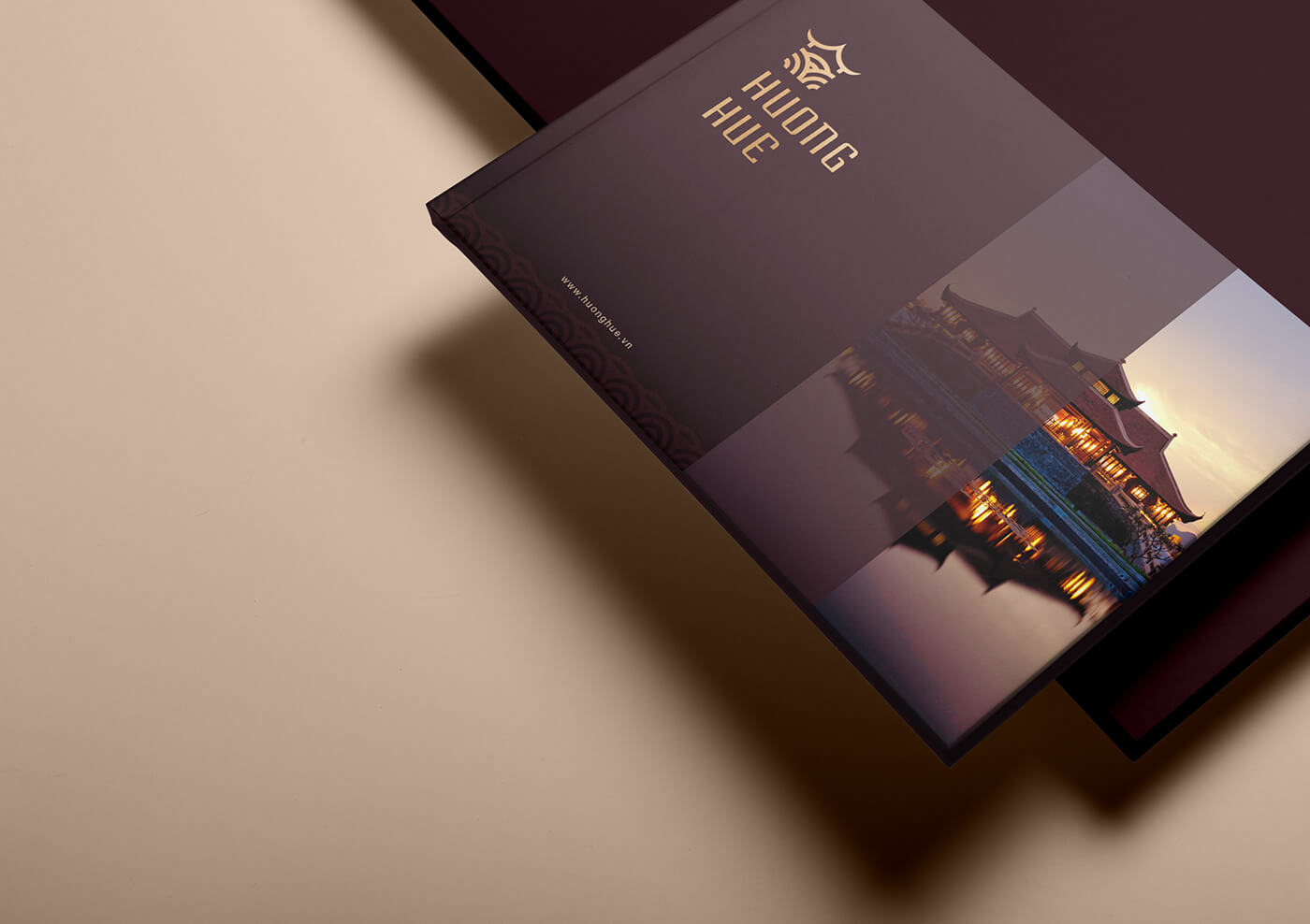
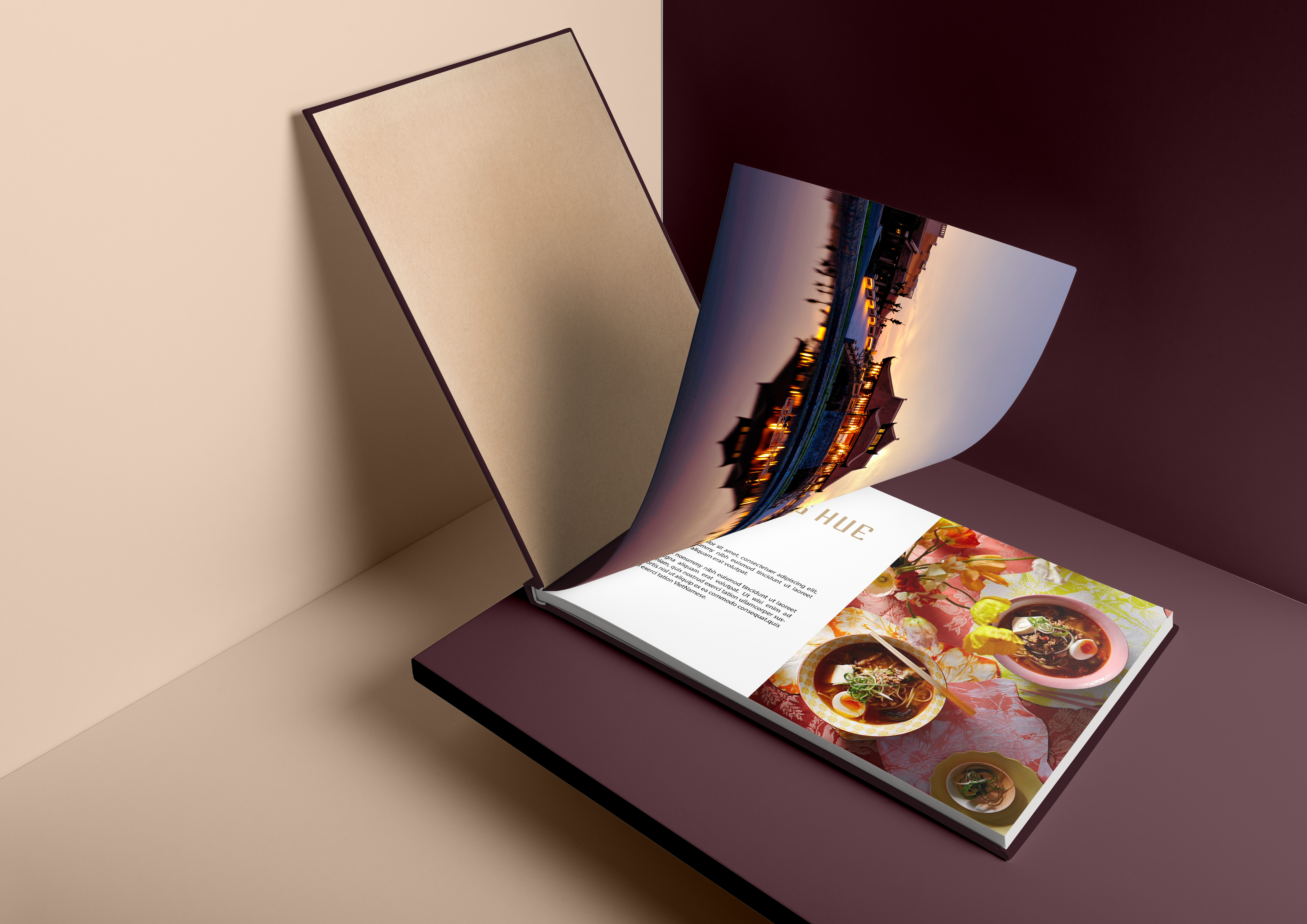
Huong Hue Resort & Restaurant is not only impressed by the friendly staff, gentle smile on the welcome lips, but also by the beauty of luxury, splendid splendor. accommodation in this place.
Huong Hue Resort & Restaurant consists of a complex of villas and hotel rooms designed and built in the style of brick houses of the Northern Delta, together with 5-star standard furniture.
Most of the villas are designed with terraces and porches, where you can sit on the soft bamboo chairs and enjoy the immense beauty of a Ba Vi or Ba Vi. See the romantic Perfume River.
Or guests can enjoy the cozy feeling with friends, relatives in the space of the community room.
—
project-huong-hue-2
project-huong-hue-3
project-huong-hue-4
project-huong-hue-5
project-huong-hue-6
project-huong-hue-7
project-huong-hue-8
project-huong-hue-9
project-huong-hue-10
project-huong-hue-11
project-huong-hue-12
project-huong-hue-13
project-huong-hue-14